
There’s nothing better than mixing textures and colours to make your home shine. Whether it is with sleek pendants beside the rough warmth of wood, or tropical fabrics beside mid-century furniture, letting your home be influenced by an array of styles doesn’t mean everything gets thrown together without thought. It means embracing what makes your heart sing!
For this new build project, we worked alongside Box Living, and Samantha Elliot from Green Room Studio. Together, we created a lively, family home. It was important that it would be practical and embrace the fun that children bring. The result is a place with plenty of spaces for adults and children to relax in, separately or together.
The home’s design is a rectangular shape that features the living area central to the ground floor in a double-height space. Upstairs, the children’s wing (bedroom and playroom) is at one end, with the master bedroom at the other end with a bridge connecting the two spaces.
Visual warmth, practicality, wood and colour were high on our list for the interior! The aim was not to be precious or match the decor – it’s just not realistic with young kids!
Plywood and white walls and ceilings provide the basic foundation on which to add colour, materials and textures. A simple setting is key to making bold accessories work, where as a busy backdrop will overwhelm a home once colour and pattern is applied. A concrete floor runs through the ground floor of the home, its shine and speckle giving an industrial interest a nice juxtaposition beside the warm grain of the wood!
Our inspiration for the space developed as we watched the house gain its structure. Being in the space with the raked ceiling and seeing all the plywood in place was the foundation – we just layered colours, textures and fun on top of that base!
We were surprised by how easy it felt to add colour. Not worrying whether everything worked together actually turned out really well!
Come and take a tour through the house and see how we got creative when it came to materials and colour!
Upstairs hallway: We could not walk past these brass-colour pendants when we saw them, we were instantly drawn to their shape. We wanted the home to feel really warm and rich in colour – these lights provide a beautiful contrasting texture to wood, but still offer warmth.
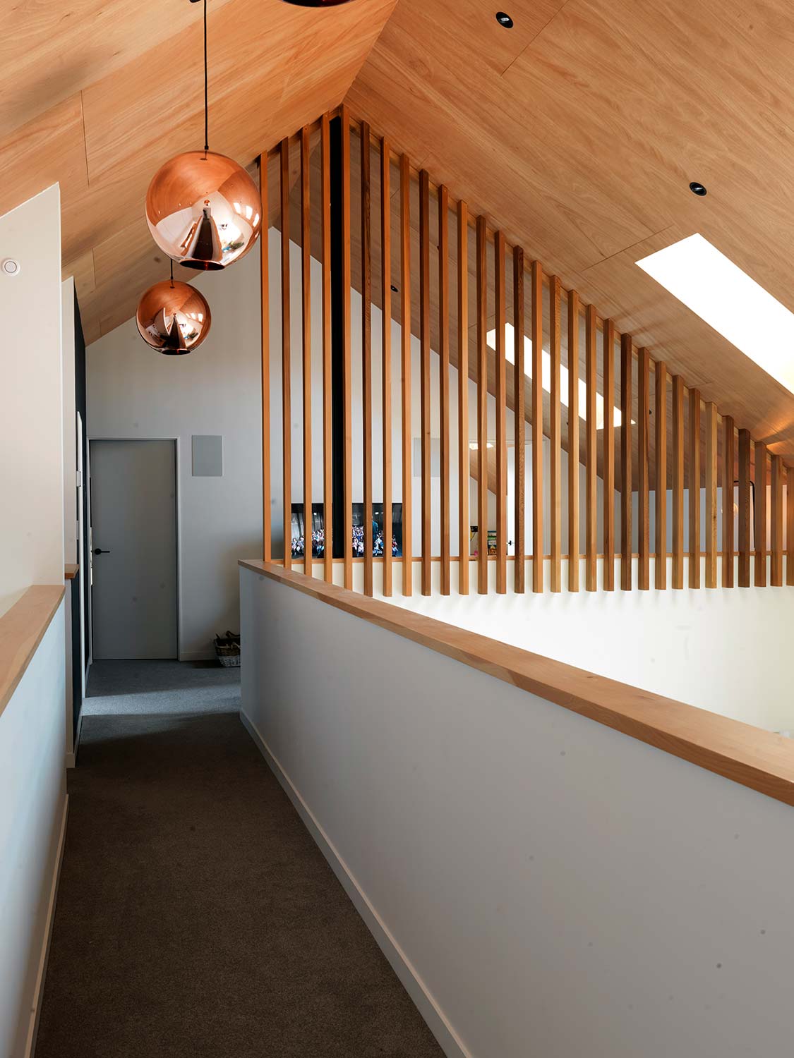
The vertical battens were a safety solution to the children potentially climbing up and leaning over the bridge wall. We had already decided to use the slats in the diner downstairs, so continuing them linked the two spaces beautifully!
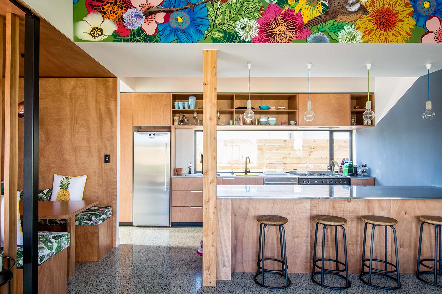
KITCHEN
We knew we would feature a bridge upstairs above the kitchen and wanted to decorate this somehow. This mural by Auckland artist Flox brings life to the plywood cabinetry and blackboard wall (which the kids love to draw on!). The island stools in black and wood tie in perfectly. In this space there are multiple textures and surfaces, but only one is very bold, so the balance is just right.
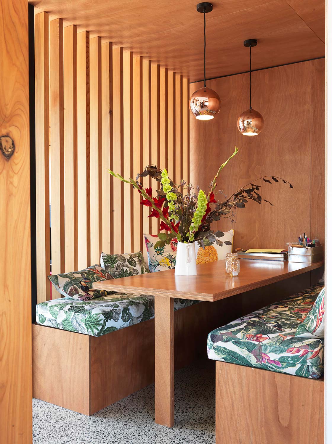
BOOTH
The cosy diner is wrapped in vertical plywood slats that let the light in but give it a lovely cocoon-like feel. We love how the brass-coloured pendants soften the space further. The chance to mix and match different types of tropical fabrics yet the same colourway was irresistible!
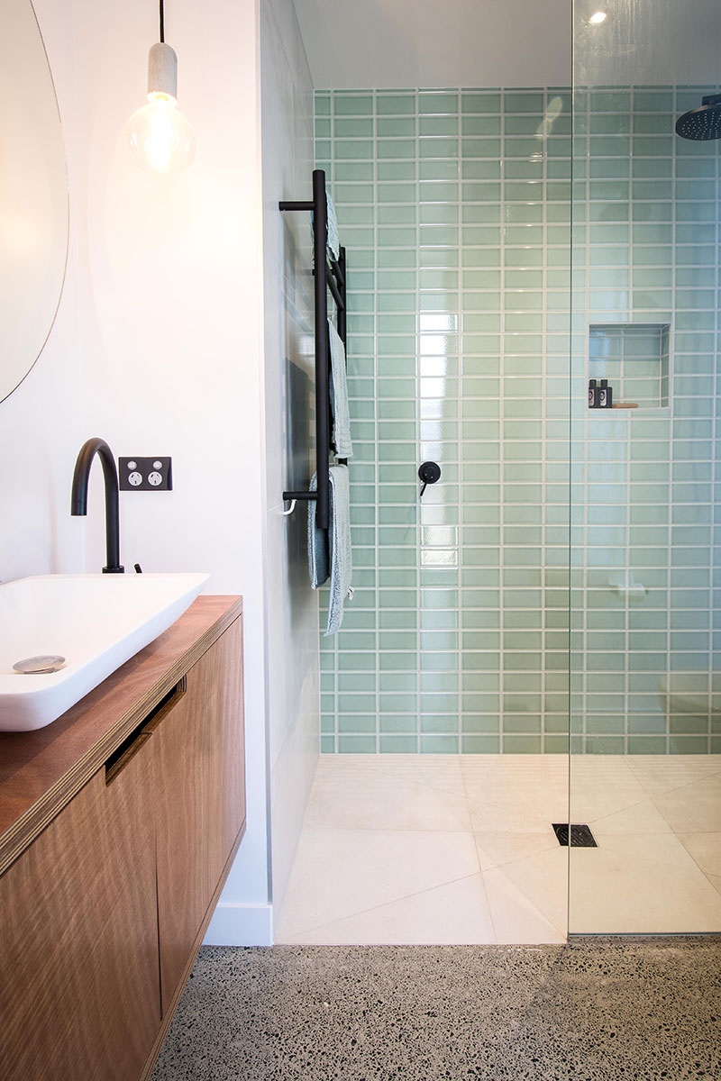
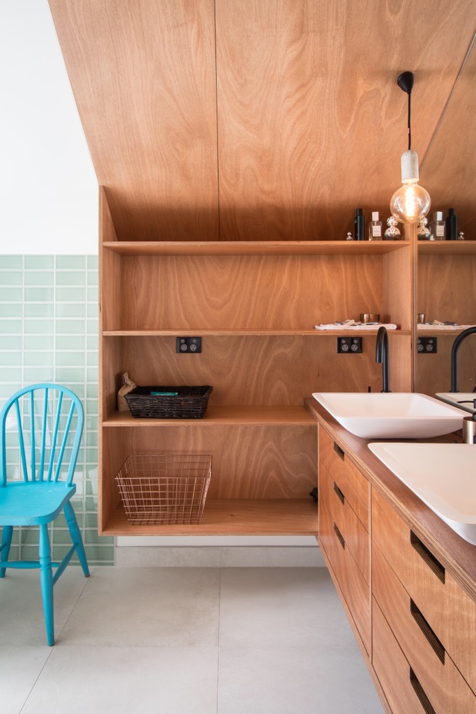
BATHROOM
We wanted to bring this particular green hue into the house somewhere, so it was a no-brainer when we saw these tiles. It works beautifully with the wooden shelving in the bathroom as well as the tapware.
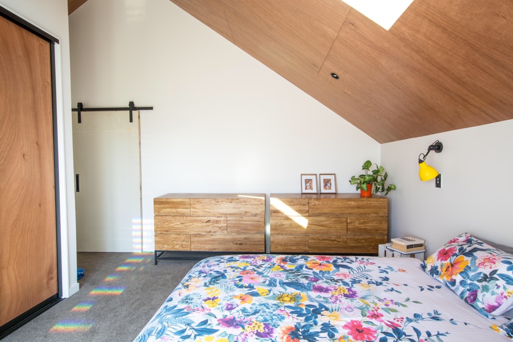
MASTER BEDROOM
Sunny yellow lights and a vibrant bedspread give our master room a happy lift. The bold colours used throughout the home can all be tied back to that statement mural in the kitchen. They are simply bold accents within the neutral plywood and white setting.
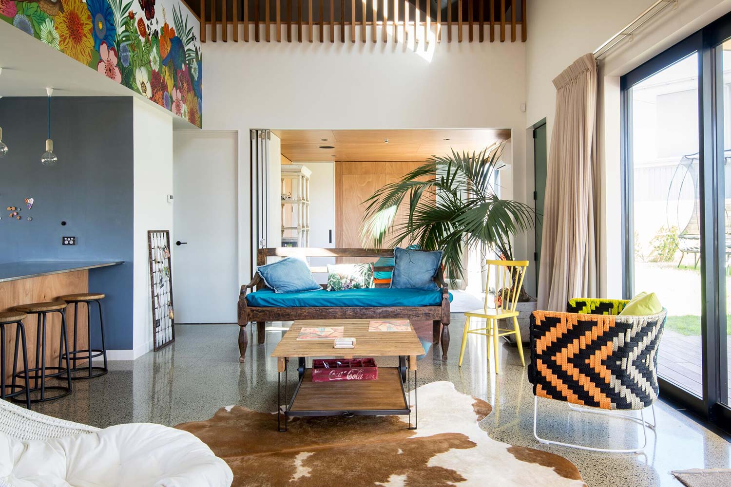
LIVING AREA
Here the space is more open than the rest of rooms, so we could have some more fun with textures such as the large cow-hide and the zig-zag orange/black chair. Neutral curtains ensure they don’t compete with the colourful mural opposite.
Polished concrete, cedar, ply, copper and colour – they all work well in creating warmth in a home. The trick is getting the balance right and not overdoing on feature. Brave textures or colours don’t have to fill a whole room, they can just be small accents that open up the space. It might feel intimidating at first, but its easy, just make sure there is a common thread running through the home, be it a colour, style or material. In our home, the colours throughout tie back to the kitchen’s mural. And remember, an interior full of smooth, shiny surfaces can feel clinical, so a beautiful bedspread or a soft rug and thick curtains in the living area can soften this.
SO GO FOR IT
Place shiny next to rough wood, or rich reds beside concrete – juxtaposing them will simply emphasise the each surfaces. Plus, they will reveal your tastes, which will make your house feel more like a home.